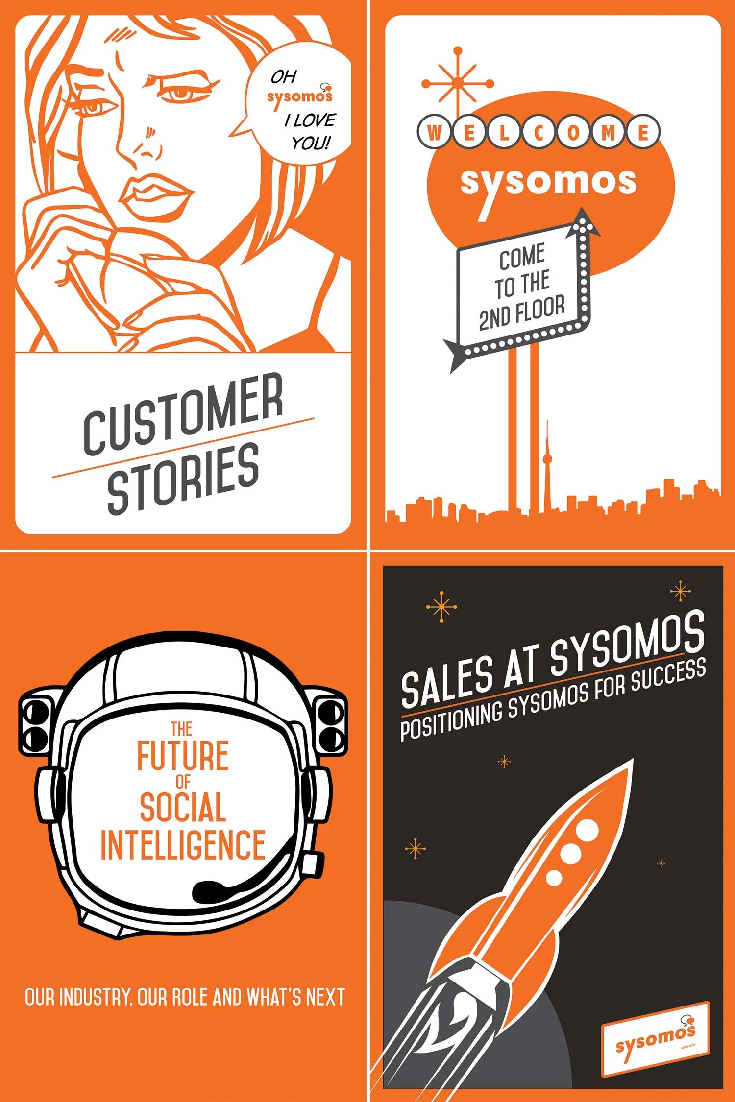


This project was a total rebrand for Sysomos. They wanted to differentiate themselves from the tech crowd. We did this by creating a strong clean look. The designs are reminiscent of modern and post modern design. Their new logo became known as the Oil Can logo because it looked similar to those designs from the 1960's. Much of the other inspiration came together from this period in design history. The client called it "Polished Hipster".